# Initialize Otter
import otter
grader = otter.Notebook("project1.ipynb")
Project 1: World Population and Poverty
In this project, you’ll explore data from Gapminder.org, a website dedicated to providing a fact-based view of the world and how it has changed. That site includes several data visualizations and presentations, but also publishes the raw data that we will use in this project to recreate and extend some of their most famous visualizations.
The Gapminder website collects data from many sources and compiles them into tables that describe many countries around the world. All of the data they aggregate are published in the Systema Globalis. Their goal is “to compile all public statistics; Social, Economic and Environmental; into a comparable total dataset.” All data sets in this project are copied directly from the Systema Globalis without any changes.
This project is dedicated to Hans Rosling (1948-2017), who championed the use of data to understand and prioritize global development challenges.
Logistics
Deadline. This project is due at 5:00pm PT on Friday 2/27. Projects will be accepted up to 1 day (24 hours) late. Projects submitted fewer than 24 hours after the deadline will receive 80% credit. It’s much better to be early than late, so start working now.
Checkpoint. For full credit on the checkpoint, you must complete the questions up to the checkpoint, pass all public autograder tests for those sections, and submit to the Pensive Project 1 Checkpoint assignment by 5:00pm PT on Friday, 2/20. The checkpoint is worth 1 lab score. After you’ve submitted the checkpoint, you may still change your project answers before the final project deadline - only your final submission, to the “Project 1” assignment, will be graded for correctness. You will have some lab time to work on these questions, but we recommend that you start the project before lab and leave time to finish the checkpoint afterward. Additionally, the second half of the project is longer than the first, so if you have time, we encourage you to continue working past the checkpoint.
Partners. You may work with one other partner; your partner must be from your assigned lab section. Only one partner should submit the project notebook to Pensive. If both partners submit, you will be docked 10% of your project grade. On Pensive, the person who submits should also designate their partner so that both of you receive credit. Once you submit, click into your submission, and there will be an option to Add Group Member in the top right corner. You may also reference this walkthrough video on how to add partners on Pensive.
Rules. Don’t share your code with anybody but your partner. You are welcome to discuss questions with other students, but don’t share the answers. The experience of solving the problems in this project will prepare you for exams (and life). If someone asks you for the answer, resist! Instead, you can demonstrate how you would solve a similar problem.
Support. You are not alone! Come to office hours, post on Ed, and talk to your classmates. If you want to ask about the details of your solution to a problem, make a private Ed post and the staff will respond. If you’re ever feeling overwhelmed or don’t know how to make progress, email your TA or tutor for help. You can find contact information for the staff on the course website.
Tests. The tests that are given are not comprehensive and passing the tests for a question does not mean that you answered the question correctly. Tests usually only check that your table has the correct column labels. However, more tests will be applied to verify the correctness of your submission in order to assign your final score, so be careful and check your work! You might want to create your own checks along the way to see if your answers make sense. Additionally, before you submit, make sure that none of your cells take a very long time to run (several minutes).
Free Response Questions: Make sure that you put the answers to the written questions in the indicated cell we provide. Every free response question should include an explanation that adequately answers the question.
Tabular Thinking Guide: Feel free to reference Tabular Thinking Guide for extra guidance.
Advice. Develop your answers incrementally. To perform a complicated table manipulation, break it up into steps, perform each step on a different line, give a new name to each result, and check that each intermediate result is what you expect. You can add any additional names or functions you want to the provided cells. Make sure that you are using distinct and meaningful variable names throughout the notebook. Along that line, DO NOT reuse the variable names that we use when we grade your answers. For example, in Question 1 of the Global Poverty section we ask you to assign an answer to latest. Do not reassign the variable name latest to anything else in your notebook, otherwise there is the chance that our tests grade against what latest was reassigned to.
You are never restricted to using only one line of code to solve a question in this project or any others. Feel free to use intermediate variables and multiple lines as much as you would like!
The point breakdown for this assignment is given in the table below:
| Category | Points |
|---|---|
| Autograder (Coding questions) | 65 |
| Written | 35 |
| Total | 100 |
To get started, load datascience, numpy, plots, and otter.
# Run this cell to set up the notebook, but please don't change it.

# These lines import the NumPy and Datascience modules.
from datascience import *
import numpy as np

# These lines do some fancy plotting magic.
%matplotlib inline
import matplotlib.pyplot as plots
plots.style.use('fivethirtyeight')

from ipywidgets import interact, interactive, fixed, interact_manual
import ipywidgets as widgets
0. Hazards with .show
As a heads up, please do not run the function tbl.show() in this assignment without an argument. For instance if you want to view a table, please type tbl.show(10) instead of tbl.show(). This may break your notebook and we cannot guarantee that we will have the capacity to aid you in this. Please answer the question below, and set the value to True to confirm you have read this and agree.
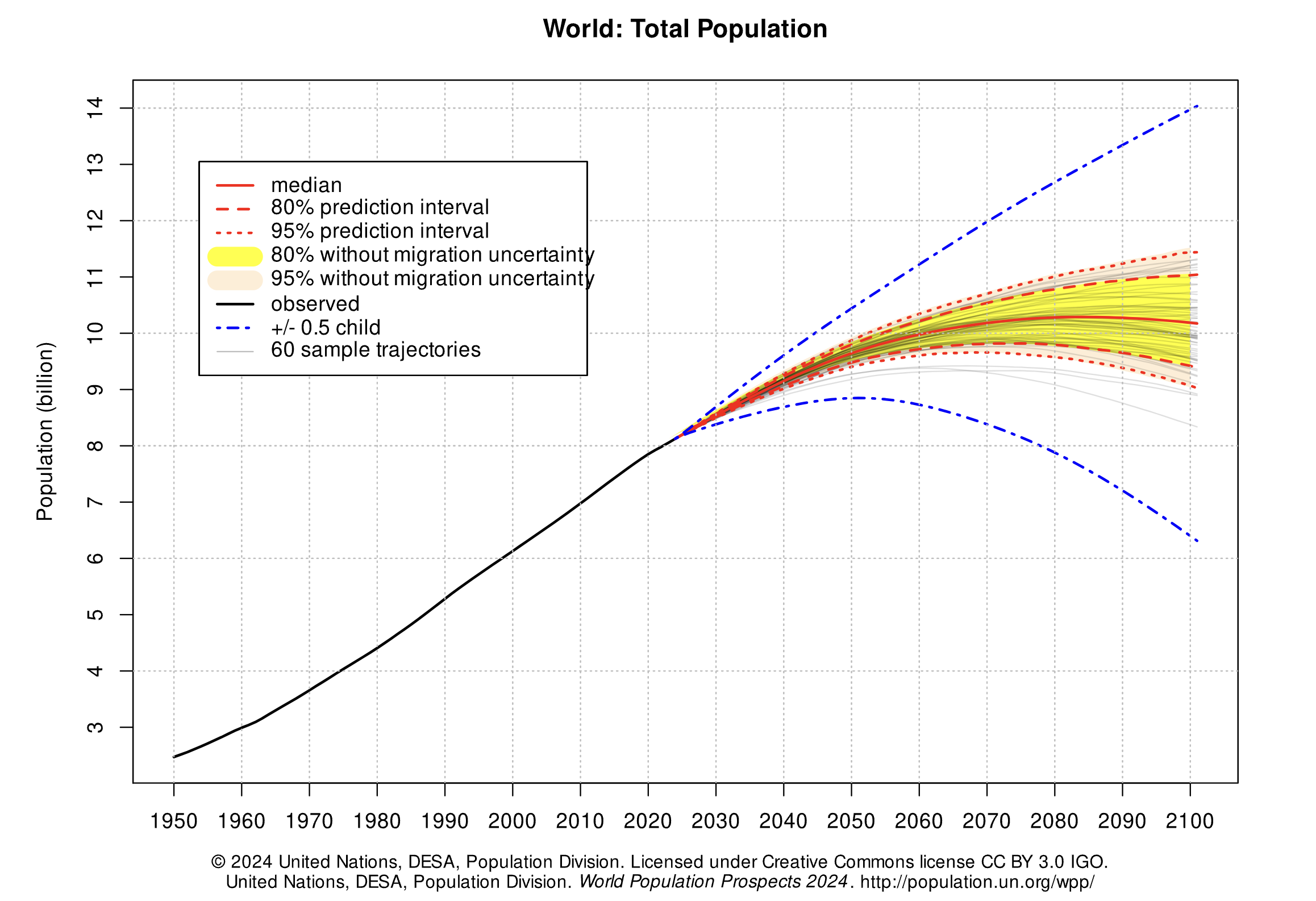
i_wont_use_show_without_an_argument = ...grader.check("q0")The global population of humans reached 1 billion around 1800, 3 billion around 1960, 7 billion around 2011, and 8 billion around 2022. The potential impact of population growth has concerned scientists, economists, and politicians alike.
The United Nations Population Division estimates that the world population will likely continue to grow throughout the 21st century, but at a slower rate, perhaps reaching and stabilizing at 10 billion by 2100. However, the UN does not rule out scenarios of slower or more extreme growth. These projections help us understand long-term population processes, even if they leave out possible global catastrophic events like war or climate crises.
In this part of the project, we will examine some of the factors that influence population growth and how they have been changing over the years and around the world. There are two main sub-parts of this analysis.
First, we will examine the data for one country, Poland. We will see how factors such as life expectancy, fertility rate, and child mortality have changed over time in Poland, and how they are related to the rate of population growth.
Next, we will examine whether the changes we have observed for Poland are particular to that country or whether they reflect general patterns observable in other countries too. We will study aspects of world population growth and see how they have been changing.
The first table we will consider contains the total population of each country over time. Run the cell below.
population = Table.read_table('population.csv').where("time", are.below(2026))
population.show(3)
Note: The population data can also be found here.
Poland
The Central European nation of Poland has undergone many changes over the centuries. In modern times it was (re)created as a democratic republic in 1919 after World War I. It was invaded and divided in World War II between Germany and the Soviet Union. War and the Holocaust had a devastating impact on its people. Poland was constituted in its current borders at the end of World War II (1945) under a communist government. In 1989, with the fall of the Soviet Union, Poland re-established itself as a democratic republic.
In this section of the project, we will examine aspects of the population of Poland since 1900. Poland’s borders have changed, so we will look at the population within its current (2025) borders.
In the population table, the geo column contains three-letter codes established by the International Organization for Standardization (ISO) in the Alpha-3 standard. Use the Alpha-3 link to find the 3-letter code for Poland.
Question 1.1. Using the population table, create a table called p_pop for Poland’s population data since 1900. It should have two columns labeled time and population_total. The first column should contain the years from 1900 through 2025 (including both 1900 and 2025) and the second column should contain the population of Poland in each of those years. (5 points)
p_pop = ...
p_popgrader.check("q1_1")Run the following cell to create a table called p_five that has the population of Poland every five years.
p_pop.set_format('population_total', NumberFormatter)

fives = np.arange(1900, 2026, 5) # 1900, 1905, 1910, ..., 2025
p_five = p_pop.sort('time').where('time', are.contained_in(fives))
p_five.show(3)
Run the following cell to visualize the population over time. Following the devastating effects of World War I and World War II, Poland’s population increased steadily from 1950 to 2000 and then leveled off. In the following questions we’ll investigate this period of population growth.
p_five.plot(0, 1)Question 1.2. Assign initial to an array that contains the population for every five year interval from 1900 to 2020 (inclusive). Then, assign changed to an array that contains the population for every five year interval from 1905 to 2025 (inclusive). The first array should include both 1900 and 2020, and the second array should include both 1905 and 2025. You should use the p_five table to create both arrays, by first filtering the table to only contain the relevant years.
The annual growth rate for a time period is equal to:
We have provided the code below that uses initial and changed in order to add a column to p_five called annual_growth. Don’t worry about the calculation of the growth rates; run the test below to test your solution.
If you are interested in how we came up with the formula for growth rates, consult the growth rates section of the textbook. (5 points)
initial = ...
changed = ...

p_1900_through_2020 = p_five.where('time', are.below_or_equal_to(2020))
p_five_growth = p_1900_through_2020.with_column('annual_growth', (changed/initial)**0.2-1)
p_five_growth.set_format('annual_growth', PercentFormatter)grader.check("q1_2")The annual growth rate in Poland has been declining since 1950, as shown in the table below.
# Run this cell to view annual growth rates in Poland since 1950.
p_five_growth.where('time', are.above_or_equal_to(1950)).show()
Next, we’ll try to understand what has changed in Poland that might explain the slowing population growth rate. Run the next cell to load three additional tables of measurements about countries over time.
life_expectancy = Table.read_table('life_expectancy.csv').where('time', are.below(2026))
child_mortality = Table.read_table('child_mortality.csv').relabel(2, 'child_mortality_under_5_per_1000_born').where('time', are.below(2026))
fertility = Table.read_table('fertility.csv').where('time', are.below(2026))
The life_expectancy table contains a statistic that is often used to measure how long people live, called life expectancy at birth. This number, for a country in a given year, does not measure how long babies born in that year are expected to live. Instead, it measures how long someone would live, on average, if the mortality conditions in that year persisted throughout their lifetime. These “mortality conditions” describe what fraction of people for each age survived the year. So, it is a way of measuring the proportion of people that are staying alive, aggregated over different age groups in the population.
The child_mortality table has the column child_mortality_under_5_per_1000_born which records the number of children who died before age 5, per 1,000 births.
The fertility table contains a statistic that is often used to measure how many babies are being born, the total fertility rate. This number describes the number of children a woman would have in her lifetime, on average, if the current rates of birth by age of the mother persisted throughout her child bearing years, assuming she survived through age 49.
Run the following cells below to see life_expectancy, child_mortality, and fertility. Refer back to these tables as they will be helpful for answering further questions!
life_expectancy.show(3)child_mortality.show(3)fertility.show(3)Question 1.3. Is population growing more slowly perhaps because people aren’t living as long? Use the life_expectancy table to draw a line graph with the years 1950 and later on the horizontal axis that shows how the life expectancy at birth has changed in Poland. (5 points)
Hint: Make sure you filter the table properly; otherwise, the graph may look funky!
# Fill in code here
...
Question 1.4. Assuming no other factors, such as birth rates or fertility rates, have changed, could the trends in life expectancy in the graph above directly explain why the population growth rate decreased since 1950 in Poland? Why or why not? (5 points)
Type your answer here, replacing this text.
Question 1.5. Complete the function fertility_over_time. It takes two input arguments, the Alpha-3 code of a country (given as country_code) and a year to start from (given as start). It returns a two-column table with the column labels Year and Children per woman. These columns can be used to generate a line chart of the country’s fertility rate each year (starting from the year given by start). The plot should include the start year and all later years that appear in the fertility table.
Then, determine the Alpha-3 code for Poland. The code at the very bottom for poland_code and the year 1950 are inputted to your fertility_over_time function. The function returns a table which we use in order to plot how Poland’s fertility rate has changed since 1950. Note that the function fertility_over_time should not return the plot itself – it returns a two-column table. The expression that draws the line plot is provided for you; please don’t change it. (5 points)
Hint: Read about tbl.relabeled in the Python Reference to rename columns.
Hint: You might find 8.0 helpful.
def fertility_over_time(country_code, start):
    """Create a two-column table that describes a country's total fertility rate each year."""
    # It's a good idea (but not required) to use multiple lines in your solution.
    ...


poland_code = ...
fertility_over_time(poland_code, 1950)grader.check("q1_5")Plotting the fertility rate in Poland since 1950, we see a downward trend.
fertility_over_time(poland_code, 1950).plot(0, 1)Question 1.6. Assuming everything else is constant, could the trends in fertility in the graph above help directly explain why the population growth rate decreased since 1950 in Poland? Why or why not? (5 points)
Type your answer here, replacing this text.
It has been observed that lower fertility rates are often associated with lower child mortality rates. We can see if this association is evident in Poland by plotting the relationship between total fertility rate and child mortality rate per 1000 children.
Question 1.7. Create a table poland_since_1950 that contains one row per year starting with 1950 and:
A column
Yearcontaining the yearA column
Children per womandescribing total fertility in Poland that yearA column
Child deaths per 1000 borndescribing child mortality in Poland that year
(5 points)
pol_fertility = fertility_over_time(poland_code, 1950)  # Try starting with the table you built already!
# It's a good idea (but not required) to use multiple lines in your solution.
pol_child_mortality = ...
pol_fertility_and_child_mortality = ...
poland_since_1950 = ...
poland_since_1950grader.check("q1_7")Run the following cell to generate a scatter plot from the poland_since_1950 table you created.
The plot uses color to encode data about the Year column. The colors, ranging from dark blue to white, represent the passing of time between 1950 and 2025. For example, a point on the scatter plot representing data from the 1950s would appear as dark blue and a point from the 2010s would appear as light blue.
x_births = poland_since_1950.column("Children per woman")
y_deaths = poland_since_1950.column("Child deaths per 1000 born")
time_colors = poland_since_1950.column("Year")

plots.figure(figsize=(6,6))
plots.scatter(x_births, y_deaths, c=time_colors, cmap="Blues_r")
plots.colorbar()
plots.xlabel("Children per woman")
plots.ylabel("Child deaths per 1000 born");
Question 1.8. In one or two sentences, describe the association (if any) that is illustrated by this scatter plot. Does the diagram show any causal relation between fertility and child mortality? (5 points)
Type your answer here, replacing this text.
Optional food for thought: What other context or information would you need in order to better understand the factors affecting life expectancy, child mortality, and fertility?
Checkpoint (due Friday 2/18 by 5:00 PM PT)


WOOOHOO!!! Fifi and Yoyo want to congratulate you on reaching the checkpoint!
Run the following cells and submit to the Pensive assignment corresponding to the checkpoint: Project 1 Checkpoint
Remember to add your project partner to your submission on Pensive! Only one partner should submit to Pensive .
Note: If you have the time, we encourage you to continue working past the checkpoint! Some students found that the next section of the project took them a lot longer to complete.
To double check your work, the cell below will rerun all of the autograder tests for Section 1.
checkpoint_tests = ["q1_1", "q1_2", "q1_5", "q1_7"]
for test in checkpoint_tests:
    display(grader.check(test))
Submission
Make sure you have run all cells in your notebook in order before running the cell below, so that all images/graphs appear in the output. The cell below will generate a zip file for you to submit. You only need to submit the zip file for the checkpoint. Please save before exporting!
# Save your notebook first, then run this cell to export your submission.
grader.export(pdf=False)
The World
The changes observed in Poland can also be observed in many other countries: except during periods of extended war, famine, and social chaos, health services generally improve, life expectancy increases, and child mortality decreases. At the same time, the fertility rate often plummets, and where it does, the population growth rate decreases despite increasing longevity.
Run the cell below to generate two overlaid histograms, one for 1962 and one for 2010, that show the distributions of total fertility rates for these two years among all 201 countries in the fertility table.
Table().with_columns(
    '1962', fertility.where('time', 1962).column(2),
    '2010', fertility.where('time', 2010).column(2)
).hist(bins=np.arange(0, 10, 0.5), unit='child per woman')
_ = plots.xlabel('Children per woman')
_ = plots.ylabel('Percent per children per woman')
_ = plots.xticks(np.arange(10))
Question 1.9. Assign fertility_statements to an array of the numbers of each statement below that can be correctly inferred from these histograms.
For example, if the answer choices you selected were 1, 2, and 3, your code should look like make_array(1, 2, 3).
In 1962, less than 20% of countries had a fertility rate below 3.
At least half of countries had a fertility rate between 5 and 8 in 1962.
In 2010, about 40% of countries had a fertility rate between 1.5 and 2.
At least half of countries had a fertility rate below 3 in 2010.
More countries had a fertility rate above 3 in 1962 than in 2010.
About the same number of countries had a fertility rate between 3.5 and 4.5 in both 1962 and 2010.
(4 points)
fertility_statements = ...grader.check("q1_9")Question 1.10. Draw a line plot of the world population from 1800 through 2025 (inclusive of both endpoints). The world population is the sum of all of the countries’ populations. You should use the population table defined earlier in the project. (5 points)
#Fill in code here
...
Question 1.11. Create a function stats_for_year that takes a year and returns a table of statistics. The table it returns should have four columns: geo, population_total, children_per_woman_total_fertility, and child_mortality_under_5_per_1000_born. Each row should contain one unique Alpha-3 country code and three statistics: population, fertility rate, and child mortality for that year from the population, fertility and child_mortality tables. Only include rows for which all three statistics are available for the country and year.
In addition, restrict the result to country codes that appears in big_50, an array of the 50 most populous countries in 2025. This restriction will speed up computations later in the project.
After you write stats_for_year, try calling stats_for_year on any year between 1960 and 2025. Try to understand the output of stats_for_year.
Hint: The tests for this question are quite comprehensive, so if you pass the tests, your function is probably correct. However, without calling your function yourself and looking at the output, it will be very difficult to understand any problems you have, so try your best to write the function correctly and check that it works before you rely on the grader tests to confirm your work.
Hint: What do all three tables have in common (pay attention to column names)?
Hint: Create additional cells before directly writing the function.
(5 points)
# We first create a population table that only includes the
# 50 countries with the largest 2025 populations. We focus on
# these 50 countries only so that plotting later will run faster.
big_50 = population.where('time', are.equal_to(2025)).sort("population_total", descending=True).take(np.arange(50)).column('geo')
population_of_big_50 = population.where('time', are.above(1959)).where('geo', are.contained_in(big_50))

def stats_for_year(year):
    """Return a table of the stats for each country that year."""
    p = population_of_big_50.where('time', are.equal_to(year)).drop('time')
    f = fertility.where('time', are.equal_to(year)).drop('time')
    c = child_mortality.where('time', are.equal_to(year)).drop('time')
    ...

...grader.check("q1_11")Question 1.12. Create a table called pop_by_decade with two columns called decade and population, in this order. It should contain a row for each year that starts a decade, in increasing order starting with 1960 and ending with 2020. For example, 1960 is the start of the 1960’s decade. The population column contains the total population of all countries included in the result of stats_for_year(year) for the first year of the decade. You should see that these countries contain most of the world’s population.
Hint: One approach is to define a function pop_for_year that computes this total population, then apply it to the decade column. Think about how you can use the stats_for_year function from the previous question if you want to implement pop_for_year.
This first test is just a sanity check for your helper function if you choose to use it. You will not lose points for not implementing the function pop_for_year.
Note: The cell where you will generate the pop_by_decade table is below the cell where you can choose to define the helper function pop_for_year. You should define your pop_by_decade table in the cell that starts with the table decades being defined.
(4 points)
def pop_for_year(year):
    """Return the total population for the specified year."""
...grader.check("q1_12_0")Now that you’ve defined your helper function (if you’ve chosen to do so), define the pop_by_decade table.
decades = Table().with_column('decade', np.arange(1960, 2021, 10))

pop_by_decade = ...
pop_by_decade.set_format(1, NumberFormatter)grader.check("q1_12")The countries table describes various characteristics of countries. The country column contains the same codes as the geo column in each of the other data tables (population, fertility, and child_mortality). The world_6region column classifies each country into a region of the world. Run the cell below to inspect the data.
countries = Table.read_table('countries.csv').where('country', are.contained_in(population.group('geo').column('geo')))
countries.select('country', 'name', 'world_6region')
Question 1.13. Create a table called region_counts. It should contain two columns called region and count. The region column should contain regions of the world, and the count column should contain the number of countries in each region that appears in the result of stats_for_year(2025).
For example, one row would have south_asia as its region value and an integer as its count value: the number of large South Asian countries for which we have population, fertility, and child mortality numbers from 2025.
Hint: You may have to relabel a column to name it region.
(4 points)
stats_for_2025 = ...
region_counts = ...
region_countsgrader.check("q1_13")The following scatter diagram compares total fertility rate and child mortality rate for each country in 1960. The area of each dot represents the population of the country, and the color represents its region of the world. Run the cell. Do you think you can identify any of the dots?
from functools import lru_cache as cache

# This cache annotation makes sure that if the same year
# is passed as an argument twice, the work of computing
# the result is only carried out once.
@cache(None)
def stats_relabeled(year):
    """Relabeled and cached version of stats_for_year."""
    return stats_for_year(year).relabel(2, 'Children per woman').relabel(3, 'Child deaths per 1000 born')

def fertility_vs_child_mortality(year):
    """Draw a color scatter diagram comparing child mortality and fertility."""
    with_region = stats_relabeled(year).join('geo', countries.select('country', 'world_6region'), 'country')
    with_region.scatter(2, 3, sizes=1, group=4, s=500)
    plots.xlim(0,10)
    plots.ylim(-50, 500)
    plots.title(year)
    plots.show()

fertility_vs_child_mortality(1960)
Question 1.14. Assign scatter_statements to an array of the numbers of each statement below that can be inferred from this scatter diagram for 1960.
All countries in
europe_central_asiahad uniformly low fertility rates.Most countries had a fertility rate above 5.
The lowest child mortality rate of any country was from an
east_asia_pacificcountry.There was an association between child mortality and fertility.
The two largest countries by population also had the two highest child mortality rates.
(4 points)
scatter_statements = ...grader.check("q1_14")The result of the cell below is interactive. Drag the slider to the right to see how countries have changed over time. You’ll find that in terms of population growth, the divide between the countries of the global North and global South that existed in the 1960s has shrunk significantly.
This shift in fertility rates is the reason that the global population is expected to grow more slowly in the 21st century than it did in the 19th and 20th centuries. Fertility rates change for reasons that include cultural patterns, better prospects for children surviving to adulthood, and family planning (such as contraception and women’s greater control over their reproduction).
Note: Don’t worry if a red warning pops up when running the cell below. You’ll still be able to run the cell!
_ = widgets.interact(fertility_vs_child_mortality,
                     year=widgets.IntSlider(min=1960, max=2025, value=1960))
Now is a great time to take a break and watch the same data presented by Hans Rosling in a 2010 TEDx talk with smoother animation and witty commentary.
When we look at population and fertility as data scientists, we need to learn about the experiences of people in real life, not just abstractly as data. We should also recognize that population studies have sometimes had political undercurrents. Those undercurrents have included population control, control of women’s reproduction, or fears of shifts between racial groups. To do better as data scientists, we should check our assumptions to avoid unthinkingly reproducing past patterns.
In 1800, 85% of the world’s 1 billion people lived in extreme poverty, defined by the United Nations as “a condition characterized by severe deprivation of basic human needs, including food, safe drinking water, sanitation facilities, health, shelter, education and information.” At the time when the data in this project were gathered, a common definition of extreme poverty was a person living on less than $1.25 a day.
In 2018, the proportion of people living in extreme poverty was estimated to be about 9%. Although the world rate of extreme poverty has declined consistently for hundreds of years, the number of people living in extreme poverty is still over 600 million. The United Nations adopted an ambitious goal: “By 2030, eradicate extreme poverty for all people everywhere.”
In this part of the project, we will examine some aspects of global poverty that might affect whether the goal is achievable. The causes of poverty are complex. They include global histories, such as colonialism, as well as factors such as health care, economics, and social inequality in each country.
First, load the population and poverty rate by country and year and the country descriptions. While the population table has values for every recent year for many countries, the poverty table only includes certain years for each country in which a measurement of the rate of extreme poverty was available.
population = Table.read_table('population.csv')
countries = Table.read_table('countries.csv').where('country', are.contained_in(population.group('geo').column('geo')))
poverty = Table.read_table('poverty.csv')
poverty.show(3)
Question 2.1. Assign latest_poverty to a three-column table with one row for each country that appears in the poverty table. The first column should contain the 3-letter code for the country. The second column should contain the most recent year for which an extreme poverty rate is available for the country. The third column should contain the poverty rate in that year. Do not change the last line, so that the labels of your table are set correctly.
Hint: think about how group works: it does a sequential search of the table (from top to bottom) and collects values in the array in the order in which they appear, and then applies a function to that array. The first function may be helpful, but you are not required to use it.
(4 points)
def first(values):
    return values.item(0)

latest_poverty = ...
latest_poverty = latest_poverty.relabeled(0, 'geo').relabeled(1, 'time').relabeled(2, 'poverty_percent') # You should *not* change this line.
latest_povertygrader.check("q2_1")Question 2.2. Using both latest_poverty and population, create a four-column table called recent_poverty_total with one row for each country in latest_poverty. The four columns should have the following labels and contents:
geocontains the 3-letter country code,poverty_percentcontains the most recent poverty percent,population_totalcontains the population of the country in 2010,poverty_totalcontains the number of people in poverty rounded to the nearest integer, based on the 2010 population and most recent poverty rate.
Hint: You are not required to use poverty_and_pop, and you are always welcome to add any additional names.
(4 points)
poverty_and_pop = ...
recent_poverty_total = ...
recent_poverty_totalgrader.check("q2_2")Question 2.3. Assign the name poverty_percent to the known percentage of the world’s 2010 population that were living in extreme poverty. Assume that the poverty_total numbers in the recent_poverty_total table describe all people in 2010 living in extreme poverty. You should get a number that is above the 2018 global estimate of 9%, since many country-specific poverty rates are older than 2018.
Hint: The sum of the population_total column in the recent_poverty_total table is not the world population, because only a subset of the world’s countries are included in the recent_poverty_total table (only some countries have known poverty rates). Use the population table to compute the world’s 2010 total population.
Hint: We are computing a percentage (value between 0 and 100), not a proportion (value between 0 and 1).
(4 points)
poverty_percent = ...
poverty_percentgrader.check("q2_3")The countries table includes not only the name and region of countries, but also their positions on the globe.
countries.select('country', 'name', 'world_4region', 'latitude', 'longitude')Question 2.4. Using both countries and recent_poverty_total, create a five-column table called poverty_map with one row for every country in recent_poverty_total. The five columns should have the following labels and contents, in this order:
latitudecontains the country’s latitude,longitudecontains the country’s longitude,namecontains the country’s name,regioncontains the country’s region from theworld_4regioncolumn ofcountries,poverty_totalcontains the country’s poverty total.
(6 points)
poverty_map = ...
poverty_mapgrader.check("q2_4")Run the cell below to draw a map of the world in which the areas of circles represent the number of people living in extreme poverty. Double-click on the map to zoom in.
Note: If the cell below isn’t loading, you can view the output here
# It may take a few seconds to generate this map.
colors = {'africa': 'blue', 'europe': 'black', 'asia': 'red', 'americas': 'green'}
scaled = poverty_map.with_columns(
    'labels', poverty_map.column('name'),
    'colors', poverty_map.apply(colors.get, 'region'),
    'areas', 1e-4 * poverty_map.column('poverty_total')
).drop('name', 'region', 'poverty_total')

Circle.map_table(scaled)
Although people lived in extreme poverty throughout the world in 2010 (with more than 5 million in the United States), the largest numbers were in Asia and Africa.
Question 2.5. Assign largest to a two-column table with the name (not the 3-letter code) and poverty_total of the 10 countries with the largest number of people living in extreme poverty.
Hint: How can we use take and np.arange in conjunction with each other?
(6 points)
largest = ...
largest.set_format('poverty_total', NumberFormatter)grader.check("q2_5")Question 2.6. It is important to study the absolute number of people living in poverty, not just the percent. The absolute number is an important factor in determining the amount of resources needed to support people living in poverty. In the next two questions you will explore this.
In Question 7, you will be asked to write a function called poverty_timeline that takes the name of a country as its argument (not the Alpha-3 country code). It should draw a line plot of the number of people living in poverty in that country with time on the horizontal axis. The line plot should have a point for each row in the poverty table for that country. To compute the population living in poverty from a poverty percentage, multiply by the population of the country in that year.
For this question, write out a generalized process for Question 7. Make sure to answer/include the following:
What should this function output?
Additionally, make a numbered list of the steps you take within the function body. If you added/edited, say, 5 lines in the function body, then it would be good to see the numbers 1 through 5 describing what you did (i.e. what functions/methods you used) in each line and why.
As a tip, after finishing question 7, we recommend polishing up your description of the steps for this question. This question will be graded for correctness.
(5 points)
Type your answer here, replacing this text.
Question 2.7. Now, we’ll actually write the function called poverty_timeline. Recall that poverty_timeline takes the name of a country as its argument (not the Alpha-3 country code). It should draw a line plot of the number of people living in poverty in that country with time on the horizontal axis. The line plot should have a point for each row in the poverty table for that country.
Note: You should not return anything from your function. Simply call plots.show() at the end of your function body.
Hint 1: This question is long. Feel free to create cells and experiment. You can create cells by going to the toolbar and hitting the + button.
Hint 2: Consider using join in your code.
Hint 3: Remember from Question 6—to compute the population living in poverty from a poverty percentage, multiply the percentage by the country’s population in that year.
Feel free to use the markdown cell below to plan out your answer, but you needn’t fill it in.
(5 points)
Type your answer here, replacing this text.
def poverty_timeline(country):
    '''Draw a timeline of people living in extreme poverty in a country.'''
    geo = ...
    # This solution will take multiple lines of code. Use as many as you need
    ...
    # Don't change anything below this line.
    plots.title(country)
    plots.ylim(bottom=0)
    plots.show() # This should be the last line of your function.
poverty_timeline('Poland')
poverty_timeline('India')
poverty_timeline('Nigeria')
poverty_timeline('China')
poverty_timeline('Colombia')
poverty_timeline('United States')Although the number of people living in extreme poverty increased in some countries including Nigeria and the United States, the decreases in other countries, most notably the massive decreases in China and India, have shaped the overall trend that extreme poverty is decreasing worldwide, both in percentage and in absolute number.
To learn more, watch Hans Rosling in a 2015 film about the UN goal of eradicating extreme poverty from the world.
Below, we’ve also added an interactive dropdown menu for you to visualize poverty_timeline graphs for other countries. Note that each dropdown menu selection may take a few seconds to run.
# Just run this cell

all_countries = poverty_map.column('name')
_ = widgets.interact(poverty_timeline, country=list(all_countries))

Mario and Mr. Fuzzles wants to tell you, you’re finished! Congratulations on discovering many important facts about global poverty and demonstrating your mastery of table manipulation and data visualization. Time to submit.
Remember to add your project partner to your submission on Pensive! Only one partner should submit to Pensive.
To double-check your work, the cell below will rerun all of the autograder tests.
grader.check_all()Submission
Make sure you have run all cells in your notebook in order before running the cell below, so that all images/graphs appear in the output. The cell below will generate a zip file for you to submit. Please save before exporting!
# Save your notebook first, then run this cell to export your submission.
grader.export(pdf=False)