from datascience import *
import numpy as np
import matplotlib
%matplotlib inline
import matplotlib.pyplot as plots
plots.style.use('fivethirtyeight')
# Predefined functions; they should look familiar to functions you've coded in assignments!
def standard_units(arr):
return (arr - np.average(arr))/np.std(arr)
def correlation(t, x, y):
x_standard = standard_units(t.column(x))
y_standard = standard_units(t.column(y))
return np.average(x_standard * y_standard)
def slope(t, x, y):
r = correlation(t, x, y)
y_sd = np.std(t.column(y))
x_sd = np.std(t.column(x))
return r * y_sd / x_sd
def intercept(t, x, y):
x_mean = np.mean(t.column(x))
y_mean = np.mean(t.column(y))
return y_mean - slope(t, x, y)*x_mean
def fitted_values(t, x, y):
"""Return an array of the regression estimates at all the x values"""
a = slope(t, x, y)
b = intercept(t, x, y)
return a*t.column(x) + b
def residuals(t, x, y):
"""Return an array of all the residuals"""
predictions = fitted_values(t, x, y)
return t.column(y) - predictionsRegression Model
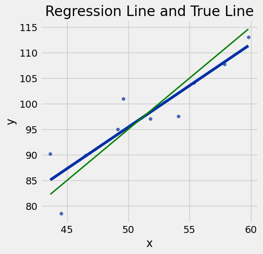
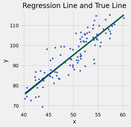
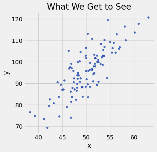
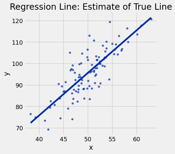
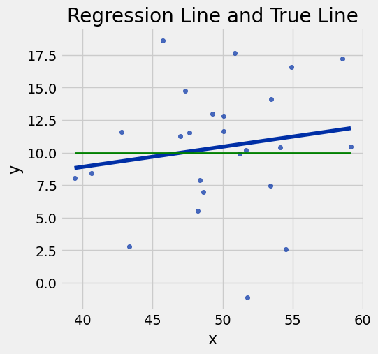
# Ignore this code; it produces plots for demonstrating the regression model
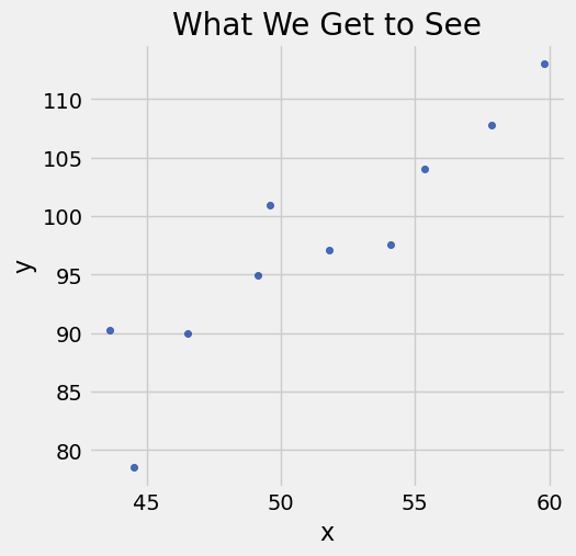
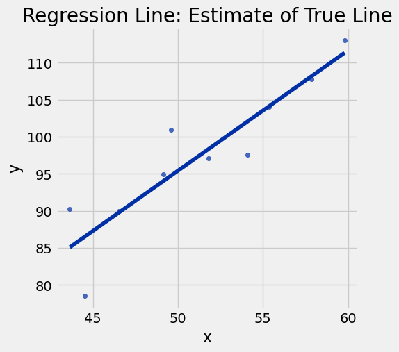
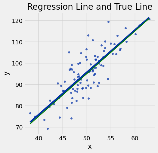
def draw_and_compare(true_slope, true_int, sample_size):
x = np.random.normal(50, 5, sample_size)
xlims = np.array([np.min(x), np.max(x)])
errors = np.random.normal(0, 6, sample_size)
y = (true_slope * x + true_int) + errors
sample = Table().with_columns('x', x, 'y', y)
sample.scatter('x', 'y')
plots.plot(xlims, true_slope*xlims + true_int, lw=2, color='green')
plots.title('True Line, and Points Created')
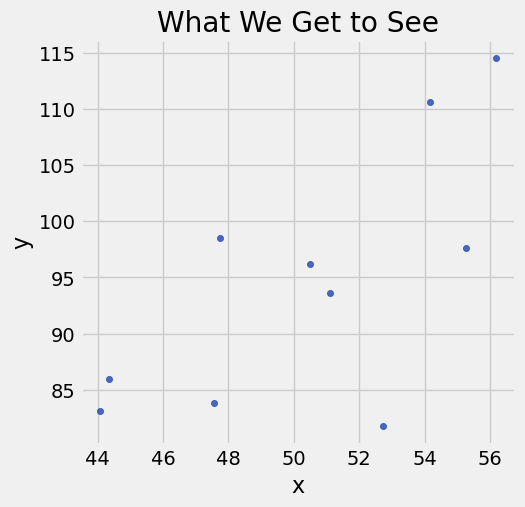
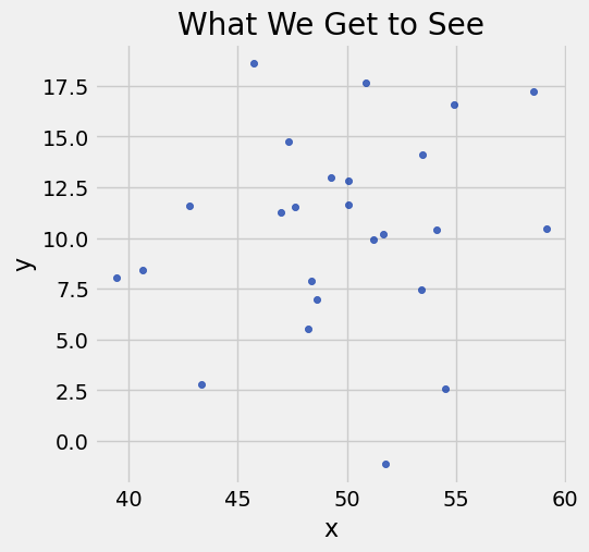
sample.scatter('x', 'y')
plots.title('What We Get to See')
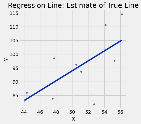
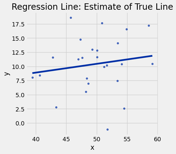
sample.scatter('x', 'y', fit_line=True)
plots.title('Regression Line: Estimate of True Line')
sample.scatter('x', 'y', fit_line=True)
plots.plot(xlims, true_slope*xlims + true_int, lw=2, color='green')
plots.title("Regression Line and True Line")draw_and_compare(2, -5, 10)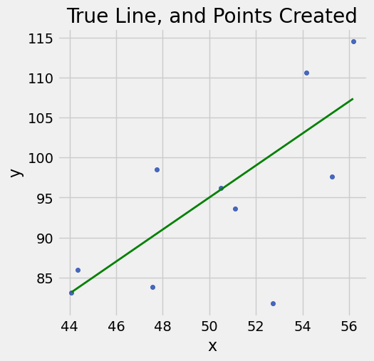
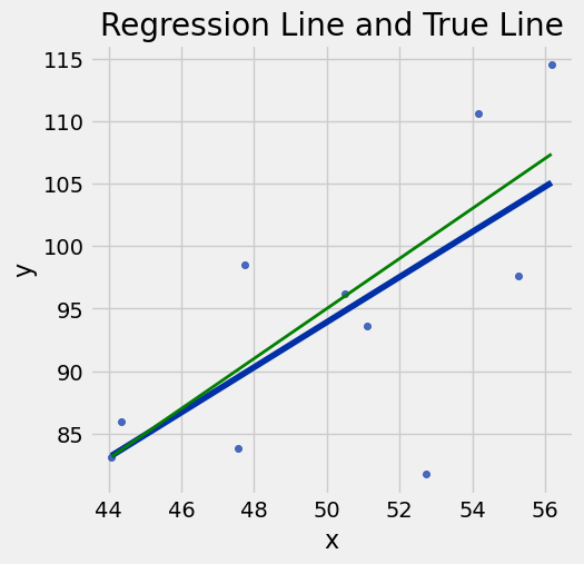
draw_and_compare(2, -5, 10)
draw_and_compare(2, -5, 100)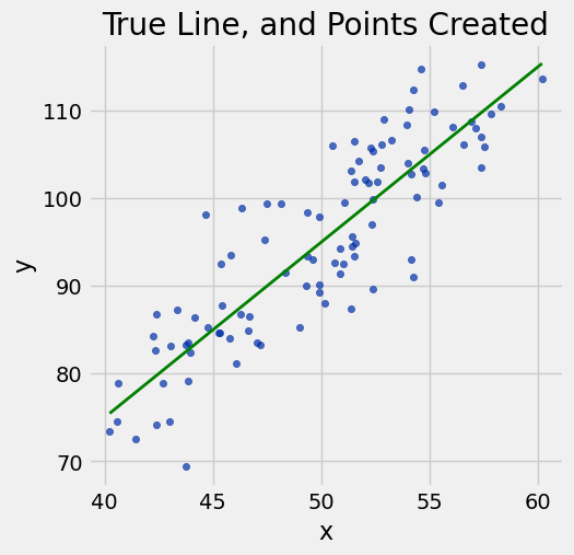
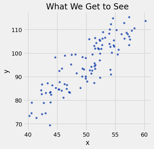
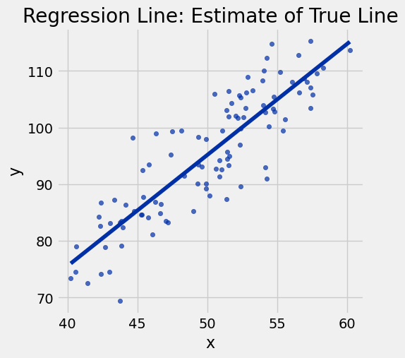
draw_and_compare(2, -5, 100)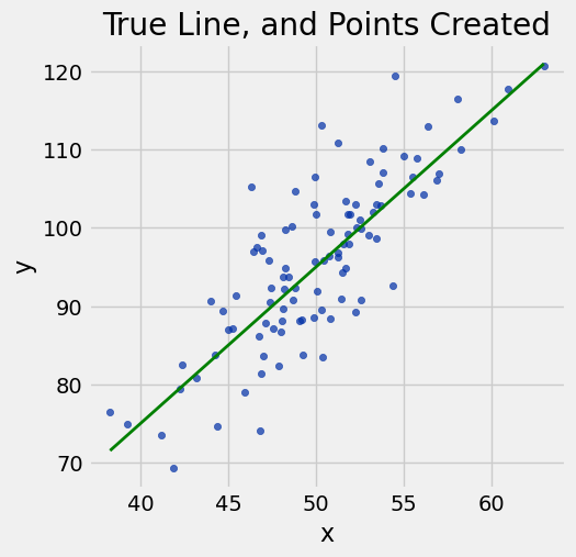
Prediction
births = Table.read_table('baby.csv')
births.show(3)
Loading...
# Preterm and postterm pregnancy cutoffs, according to the CDC
37 * 7, 42 * 7
(259, 294)births.scatter('Gestational Days', 'Birth Weight')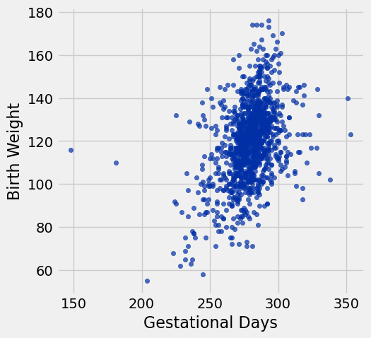
births = births.where('Gestational Days', are.between(225, 325))births.scatter('Gestational Days', 'Birth Weight')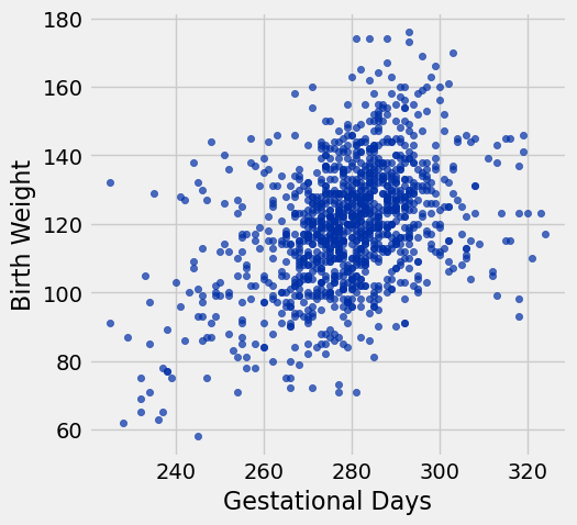
Suppose we assume the regression model
correlation(births, 'Gestational Days', 'Birth Weight')0.42295118452423991births.scatter('Gestational Days', 'Birth Weight', fit_line=True)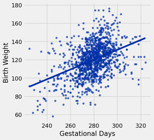
Prediction at a Given Value of x
def prediction_at(t, x, y, x_value):
'''
t - table
x - label of x column
y - label of y column
x_value - the x value for which we want to predict y
'''
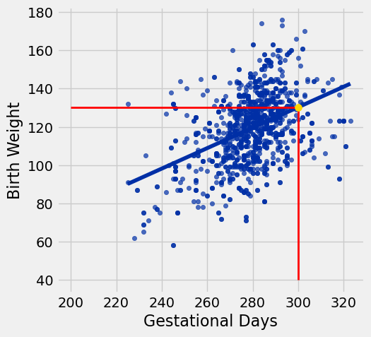
return slope(t, x, y) * x_value + intercept(t, x, y)prediction_at_300 = prediction_at(births, 'Gestational Days', 'Birth Weight', 300)
prediction_at_300130.80951674248769prediction_at(births, 'Gestational Days', 'Birth Weight', 260)109.29570203577155x = 300
births.scatter('Gestational Days', 'Birth Weight', fit_line=True)
plots.plot([x, x], [40, prediction_at_300], color='red', lw=2);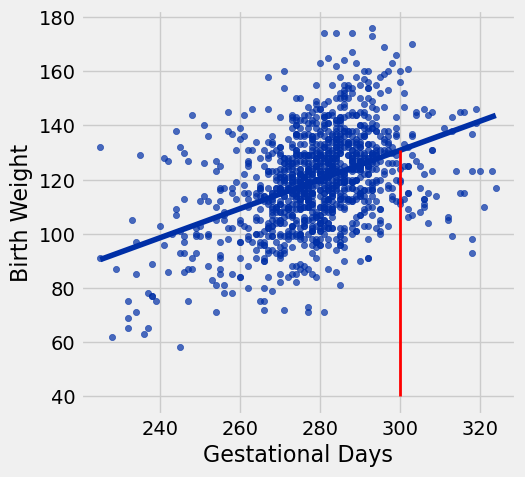
Bootstrapping the Sample
# You don't need to understand the plotting code in this cell,
# but you should understand the figure that comes out.
plots.figure(figsize=(10, 11))
plots.subplot(3, 2, 1)
plots.scatter(births[1], births[0], s=10, color='darkblue')
plots.xlim([225, 325])
plots.title('Original sample')
for i in np.arange(1, 6, 1):
plots.subplot(3,2,i+1)
resampled = births.sample()
plots.scatter(resampled.column('Gestational Days'), resampled.column('Birth Weight'), s=10, color='tab:green')
plots.xlim([225, 325])
plots.title('Bootstrap sample '+str(i))
plots.tight_layout()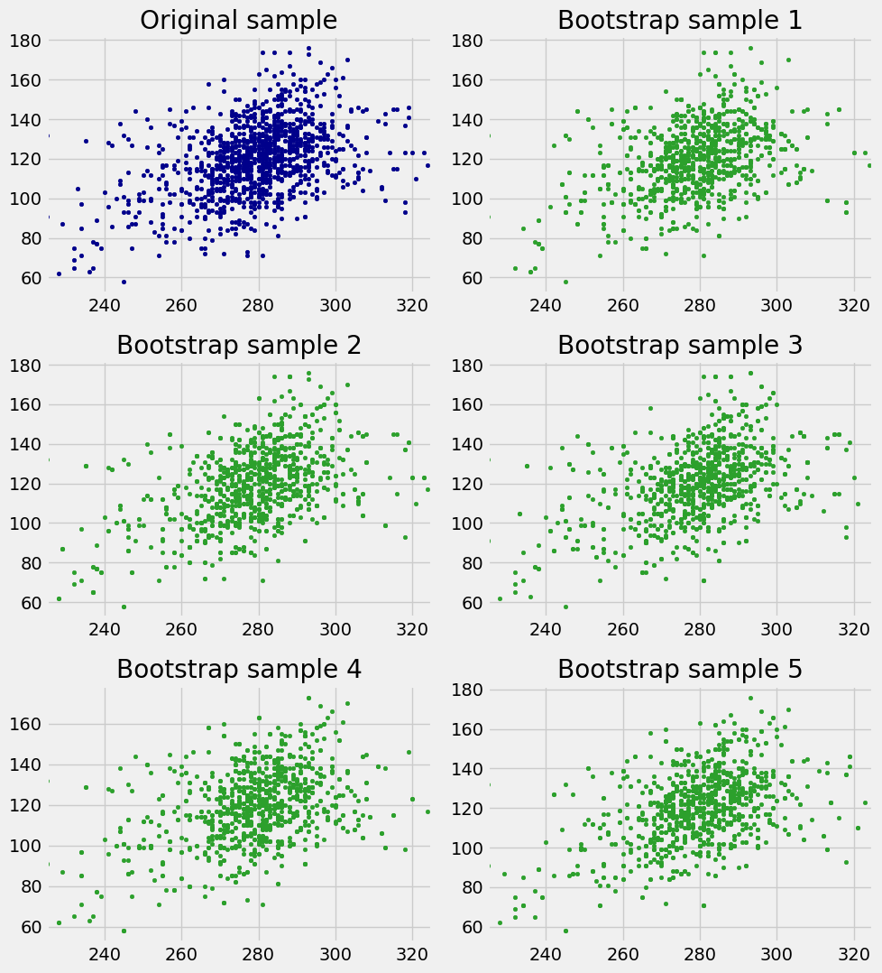
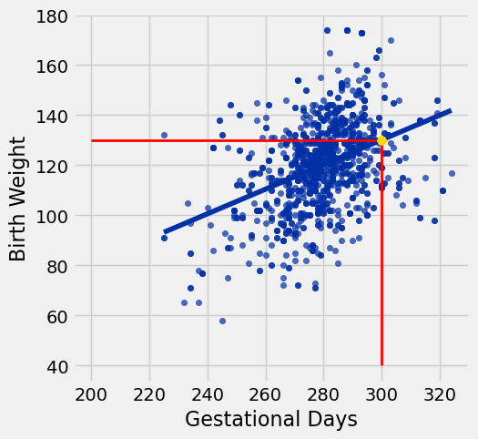
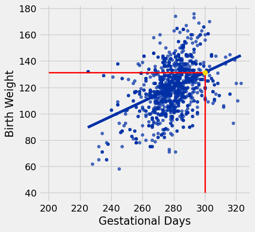
for i in np.arange(4):
resample = births.sample()
predicted_y = prediction_at(resample, 'Gestational Days', 'Birth Weight', 300)
print('Predicted y from bootstrap sample was', predicted_y)
resample.scatter('Gestational Days', 'Birth Weight', fit_line=True)
plots.scatter(300, predicted_y, color='gold', s=50, zorder=3);
plots.plot([x, x], [40, predicted_y], color='red', lw=2);
plots.plot([200, x], [predicted_y, predicted_y], color='red', lw=2);Predicted y from bootstrap sample was 130.115816965
Predicted y from bootstrap sample was 131.397935957
Predicted y from bootstrap sample was 130.277967429
Predicted y from bootstrap sample was 130.953463926
lines = Table(['slope','intercept', 'at 210', 'at 300', 'at 320'])
for i in range(10):
resample = births.sample()
a = slope(resample, 'Gestational Days', 'Birth Weight')
b = intercept(resample, 'Gestational Days', 'Birth Weight')
lines.append([a, b, a * 210 + b, a * 300 + b, a * 320 + b])
for i in np.arange(lines.num_rows):
line = lines.row(i)
plots.plot([210, 320], [line.item('at 210'), line.item('at 320')], lw=1)
plots.scatter(300, line.item('at 300'), s=30, zorder=3)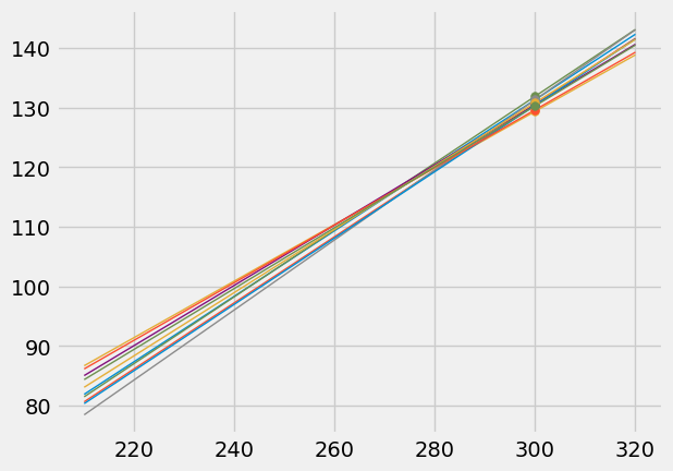
np.mean(births.column('Gestational Days')), np.mean(births.column('Birth Weight'))(279.11015490533561, 119.57401032702238)lines = Table(['slope','intercept', 'at 291', 'at 300', 'at 309'])
for i in range(10):
resample = births.sample()
a = slope(resample, 'Gestational Days', 'Birth Weight')
b = intercept(resample, 'Gestational Days', 'Birth Weight')
lines.append([a, b, a * 291 + b, a * 300 + b, a * 309 + b])
lines
Loading...
for i in np.arange(lines.num_rows):
line = lines.row(i)
plots.plot([291, 309], [line.item('at 291'), line.item('at 309')], lw=1)
plots.scatter(300, line.item('at 300'), s=30, zorder=3)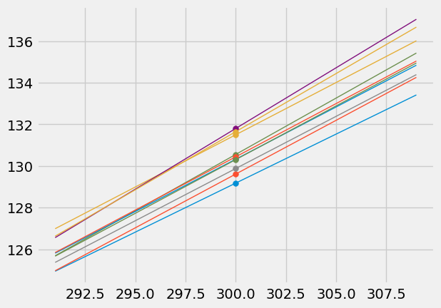
Prediction Interval
def bootstrap_prediction(t, x, y, new_x, repetitions=2500):
"""
Makes a 95% confidence interval for the height of the true line at new_x,
using linear regression on the data in t (column names x and y).
Shows a histogram of the bootstrap samples and shows the interval
in gold.
"""
# Bootstrap the scatter, predict, collect
predictions = make_array()
for i in np.arange(repetitions):
resample = t.sample()
predicted_y = prediction_at(resample, x, y, new_x)
predictions = np.append(predictions, predicted_y)
# Find the ends of the approximate 95% prediction interval
left = percentile(2.5, predictions)
right = percentile(97.5, predictions)
round_left = round(left, 3)
round_right = round(right, 3)
# Display results
Table().with_column('Prediction', predictions).hist(bins=20)
plots.xlabel('predictions at x='+str(new_x))
plots.plot([left, right], [0, 0], color='yellow', lw=8);
print('Approximate 95%-confidence interval for height of true line at x =', new_x)
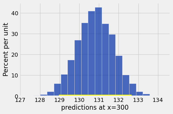
print(round_left, 'to', round_right, '( width =', round(right - left, 3), ')') bootstrap_prediction(births, 'Gestational Days', 'Birth Weight', 300)Approximate 95%-confidence interval for height of true line at x = 300
128.955 to 132.657 ( width = 3.702 )
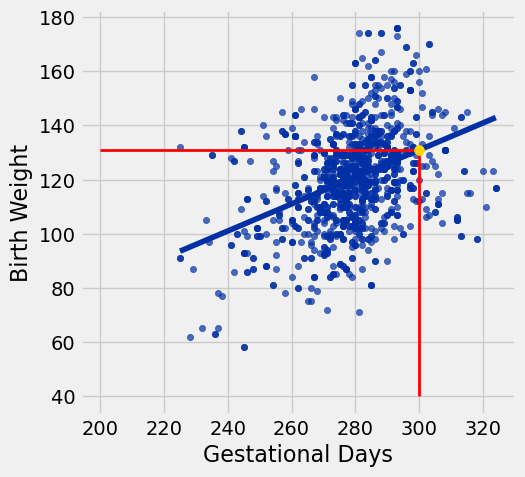
Predictions at Different Values of x
x = 300
births.scatter('Gestational Days', 'Birth Weight', fit_line=True)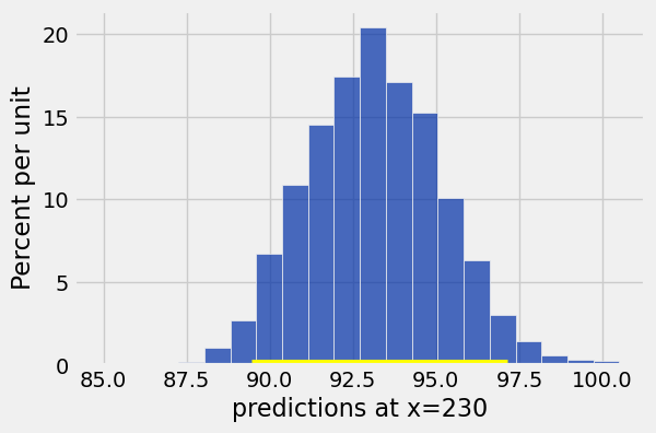
plots.plot([x, x], [40, prediction_at_300], color='red', lw=2);bootstrap_prediction(births, 'Gestational Days', 'Birth Weight', 230)Approximate 95%-confidence interval for height of true line at x = 230
89.452 to 97.141 ( width = 7.688 )
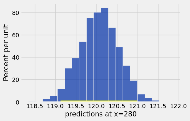
bootstrap_prediction(births, 'Gestational Days', 'Birth Weight', 280)Approximate 95%-confidence interval for height of true line at x = 280
119.124 to 120.985 ( width = 1.861 )
# No need to follow the code in this cell; just understand the graph

lines = Table(['slope','intercept', 'at 210', 'at 300', 'at 320'])

for i in range(10):
    resample = births.sample()
    a = slope(resample, 'Gestational Days', 'Birth Weight')
    b = intercept(resample, 'Gestational Days', 'Birth Weight')
    lines.append([a, b, a * 210 + b, a * 300 + b, a * 320 + b])

for i in np.arange(lines.num_rows):
    line = lines.row(i)
    plots.plot([210, 320], [line.item('at 210'), line.item('at 320')], lw=1)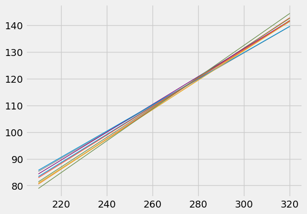
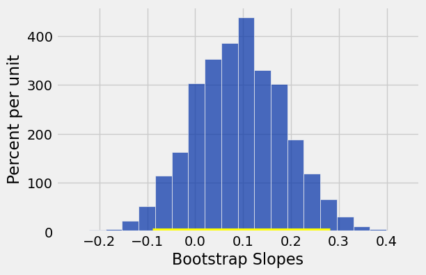
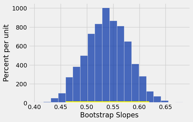
Inference for the True Slope
births.scatter('Gestational Days', 'Birth Weight', fit_line=True)slope(births, 'Gestational Days', 'Birth Weight')0.53784536766790358def bootstrap_slope(t, x, y, repetitions=2500):
"""
Makes a 95% confidence interval for the slope of the true line,
using linear regression on the data in t (column names x and y).
Shows a histogram of the bootstrap samples and shows the interval
in gold.
"""
# Bootstrap the scatter, find the slope, collect
slopes = make_array()
for i in np.arange(repetitions):
bootstrap_sample = t.sample()
bootstrap_slope = slope(bootstrap_sample, x, y)
slopes = np.append(slopes, bootstrap_slope)
# Find the endpoints of the 95% confidence interval for the true slope
left = percentile(2.5, slopes)
right = percentile(97.5, slopes)
round_left = round(left, 3)
round_right = round(right, 3)
# Slope of the regression line from the original sample
observed_slope = slope(t, x, y)
# Display results (no need to follow this code)
Table().with_column('Bootstrap Slopes', slopes).hist(bins=20)
plots.plot(make_array(left, right), make_array(0, 0), color='yellow', lw=8);
print('Slope of regression line:', round(observed_slope, 3))
print('Approximate 95%-confidence interval for the slope of the true line:')
print(round_left, 'to', round_right)bootstrap_slope(births, 'Gestational Days', 'Birth Weight')Slope of regression line: 0.538
Approximate 95%-confidence interval for the slope of the true line:
0.459 to 0.618
births.num_rows1162Zero Correlation Regression
draw_and_compare(0, 10, 25)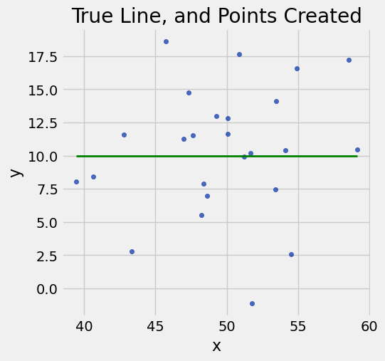
Maternal Age and Birth Weight
births.scatter('Maternal Age', 'Birth Weight')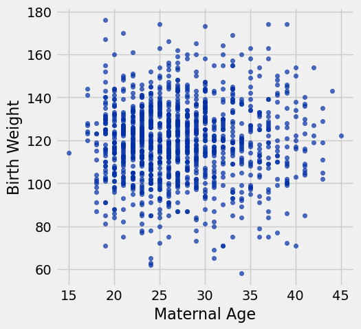
slope(births, 'Maternal Age', 'Birth Weight')0.095142237298344659births.scatter('Maternal Age', 'Birth Weight', fit_line=True)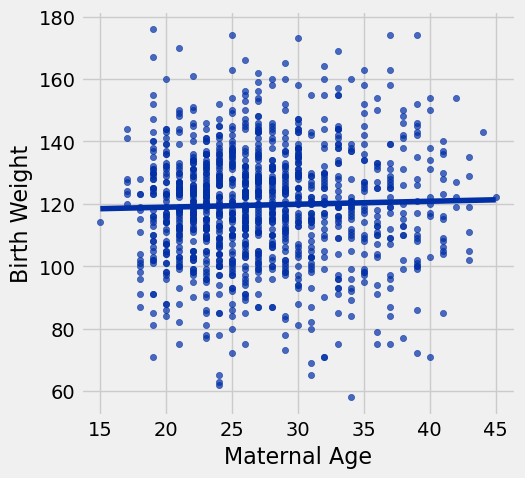
Null: Slope of true line is equal to 0.
Alternative: Slope of true line is not equal to 0.
bootstrap_slope(births, 'Maternal Age', 'Birth Weight')Slope of regression line: 0.095
Approximate 95%-confidence interval for the slope of the true line:
-0.089 to 0.281